
Your business plan is ready, your strategy is solid, and now comes the fun part – designing your company logo! A good logo is such an important aspect of a business, it’s the visual expression of a company’s identity and allows for instant brand recognition from those who see it. That’s why it’s so important to get it right.
With this in mind, if you’re in the fortunate position to start your own business, surely you’ll want to emulate the big dogs, right? Well, you’re in luck! A recent study analyzed the logos of Fortune 500 companies looking at color and font choices to see what these giants of industry had in common and what stood out.
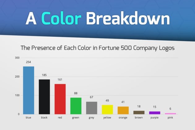
Blue, Black, and Red are the clear winners in color choice with the majority of companies using them. As it turns out, two is the magic number. 44% of Fortune 500 companies use just two colors in their logos. Black and red is the most favored pairing with 18% of companies choosing this combination. Going over two colors is a rare occurrence and only 18% of companies have 3-5 colors in their logo, less is more it seems.
Is pink bad for business? Only 6 companies in the Fortune 500 list having this color in their logo; it’s certainly not the most popular choice.
What about fonts and font case? Well, 46% of companies must think caps lock is cruise control for awesome since they used all capitalization in their logo’s. However, 6% don’t feel capitals are best and use all lowercase letters.
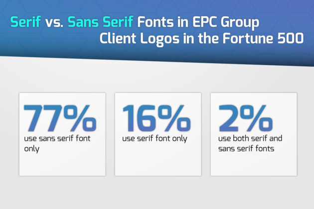
To hell with Helvetica? I’m afraid not, sans-serif fonts are the most used by companies with a whopping 75% of companies using sans-serif fonts only. After all, you wouldn’t trust anyone using Comic Sans, would you?
Hopefully, you’re now ready to make the best logo the world has ever seen and make your way onto that Fortune 500 list. Just remember not to use Comic Sans!