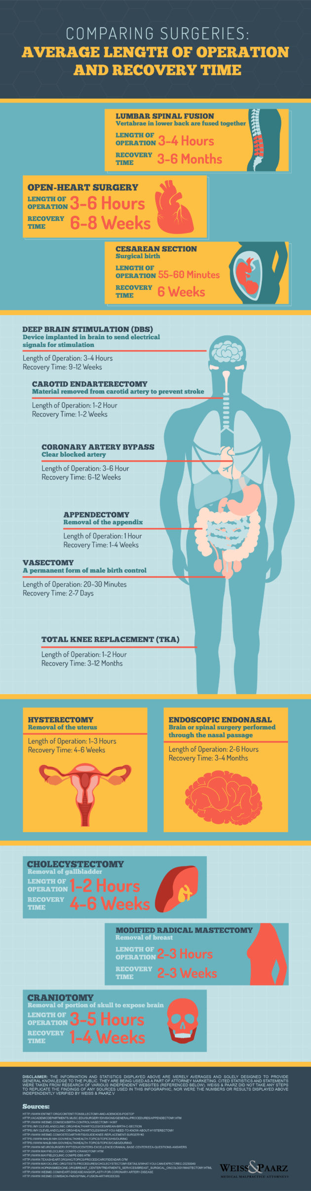
As an analyst, it’s my job to look at the numbers to try and recommend the best course of action or to provide the best solution. Working in the healthcare sector, I understand the importance of getting the correct information. I recently came across a graphic that I loved. It was on different surgeries. It was informative and provided an overview with statistics on both operating and recovery times.
As modern technology continues to advance, there are new surgeries and new methods for existing operations becoming realities every single day. I really like a few things about this graphic. First, I like how many different kinds of surgeries are included. There’s stuff on the head, the heart, and even male and female specific. And the information is factual. I recently had a relative have open heart surgery. The recovery time was about 7 weeks, which is spot on to this graphic.
The other thing I like about this infographic is how it looks. I think it looks fantastic and is very aesthetically pleasing. The colors are pleasant, the font is easy to read. And the illustrations for the different body parts are great. It’s clear that someone took the time to put together a quality product. I appreciate that, especially in a world full of boring or simply ugly infographics.
As an analyst, I always want to get the correct information before making a decision. When it comes to surgeries, that’s even more important. When I saw this graphic that Weiss & Paarz put together, I knew it was something I had to share. It’s not only useful, but it’s such a great looking graphic.